Health Data Activity
Our task was to use hospital patient data to analyse the effects of certain variables on blood pressure.
I used the "tidyverse" library.
library(tidyverse)
Here's a "glimpse" of the patient data.
glimpse(Health_Data)

Rows: 210
Columns: 17
$ ID_no       <dbl> 1, 2, 3, 4, 5, 6, 7, 8, 9, 10, 11, 12, 13, 14, 15, 16, 17, 18, 19, 20…
$ age         <dbl> 30, 41, 14, 28, 38, 26, 29, 36, 20, 29, 24, 28, 37, 36, 26, 33, 34, 3…
$ sex         <chr+lbl> "f", "m", "m", "m", "m", "m", "f", "f", "f", "f", "f", "m", "m", …
$ sex_1       <dbl+lbl> 0, 1, 1, 1, 1, 1, 0, 0, 0, 0, 0, 1, 1, 1, 0, 0, 1, 1, 1, 1, 1, 0,…
$ religion    <dbl+lbl> 1, 2, 1, 1, 1, 2, 2, 1, 2, 1, 1, 1, 1, 1, 1, 1, 2, 1, 1, 1, 2, 2,…
$ religion_2  <dbl+lbl> 1, 4, 1, 1, 1, 4, 2, 1, 4, 1, 1, 1, 1, 1, 1, 1, 4, 1, 1, 1, 4, 2,…
$ occupation  <dbl+lbl> 1, 4, 4, 1, 2, 4, 1, 2, 3, 1, 3, 4, 2, 4, 4, 2, 3, 3, 3, 1, 1, 3,…
$ income      <dbl> 79774, 70295, 100117, 105528, 71417, 95920, 72785, 65365, 84255, 7720…
$ sbp         <dbl> 107, 105, 157, 101, 101, 123, 148, 100, 102, 141, 122, 120, 111, 146,…
$ dbp         <dbl> 75, 75, 90, 71, 77, 86, 95, 72, 80, 100, 90, 70, 80, 81, 110, 112, 77…
$ f_history   <dbl+lbl> 0, 0, 0, 0, 0, 0, 1, 1, 1, 1, 0, 0, 0, 1, 1, 0, 0, 1, 0, 0, 0, 1,…
$ pepticulcer <dbl+lbl> 2, 1, 2, 2, 2, 1, 2, 1, 2, 1, 2, 1, 2, 1, 1, 2, 2, 2, 2, 2, 2, 2,…
$ diabetes    <dbl+lbl> 2, 1, 2, 2, 1, 1, 1, 2, 2, 2, 1, 2, 2, 1, 2, 2, 2, 2, 1, 2, 1, 1,…
$ post_test   <dbl> 94.0, NA, NA, NA, NA, NA, 100.0, 90.5, 96.5, 100.0, 84.0, NA, NA, NA,…
$ pre_test    <dbl> 40.5, NA, NA, NA, NA, NA, 87.5, 65.5, 51.0, 55.5, 47.0, NA, NA, NA, 7…
$ date_ad     <date> 2020-05-02, 2020-05-02, 2020-05-02, 2020-05-02, 2020-05-02, 2020-05-…
$ date_dis    <date> 2020-05-07, 2020-05-06, 2020-05-08, 2020-05-10, 2020-05-11, 2020-05-…
First we found the mean, median and mode of the variables "sbp", "dbp" and "income".
I used summary() to find the mean and median.
Health_Data %>%
  select(sbp, dbp, income) %>%
  summary()

      sbp             dbp             income
 Min.   : 91.0   Min.   : 60.00   Min.   : 52933
 1st Qu.:114.0   1st Qu.: 74.00   1st Qu.: 68636
 Median :123.0   Median : 82.00   Median : 86560
 Mean   :127.7   Mean   : 82.77   Mean   : 85194
 3rd Qu.:141.8   3rd Qu.: 90.00   3rd Qu.: 99696
 Max.   :195.0   Max.   :115.00   Max.   :117210
I used count() to find the mode.
Health_Data %>%
  count(sbp, sort = TRUE)

# A tibble: 70 × 2
     sbp     n
   <dbl> <int>
 1   120    12
 2   102     9
 3   122     9

Health_Data %>%
  count(dbp, sort = TRUE)

# A tibble: 43 × 2
     dbp     n
   <dbl> <int>
 1    74    13
 2    80    13
 3    82    13

Health_Data %>%
  count(income, sort = TRUE)

# A tibble: 210 × 2
   income     n
    <dbl> <int>
 1  52933     1
 2  53435     1
 3  53976     1
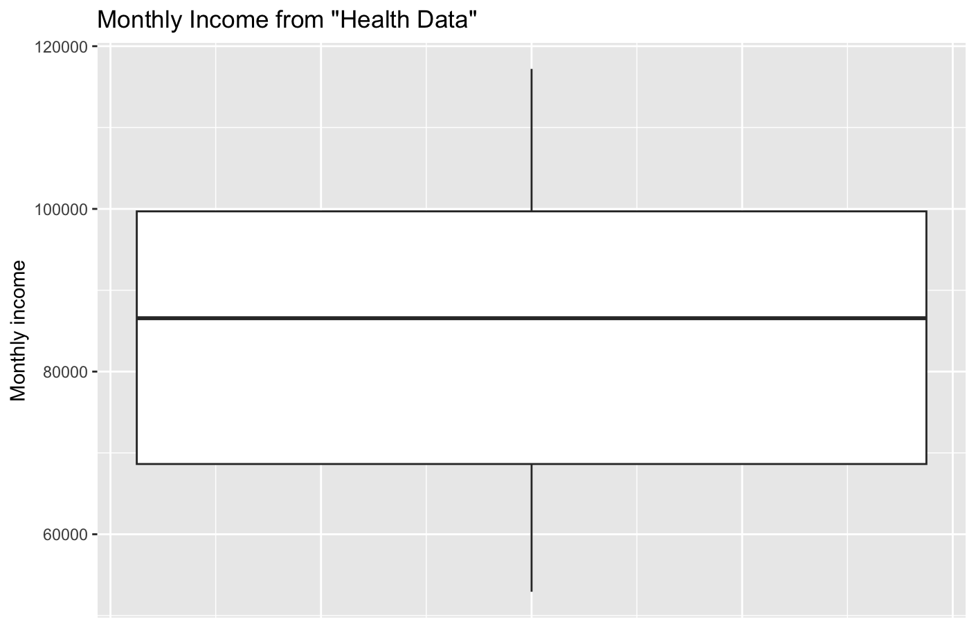
This showed "income" has no mode.
I showed "income" on a boxplot.
Health_Data %>%
  ggplot(aes(y = income)) +
  geom_boxplot() +
  labs(title = "Monthly Income from \"Health Data\"") +
  theme(axis.text.x = element_blank(), axis.ticks.x = element_blank())
Next we found the mean, median and mode of the "age" variable.
I used summary() to find the mean and median.
Health_Data %>%
  select(age) %>%
  summary()

      age
 Min.   : 6.00
 1st Qu.:21.00
 Median :27.00
 Mean   :26.51
 3rd Qu.:32.00
 Max.   :45.00
I used count() to find the mode.
Health_Data %>%
  count(age, sort = TRUE)

# A tibble: 35 × 2
     age     n
   <dbl> <int>
 1    26    16
 2    29    15
 3    20    14
Our next task was to see if there is any association between systolic blood pressure and peptic ulcers.
I showed "systolic blood pressure" on a boxplot for patients without and with peptic ulcers.
Health_Data %>%
  ggplot(aes(x = factor(pepticulcer), y = sbp)) +
  geom_boxplot() +
  labs(title = "Systolic Blood Pressure of Patients with Peptic Ulcers", x = "peptic ulcers") +
  scale_x_discrete(labels = c("no", "yes"))
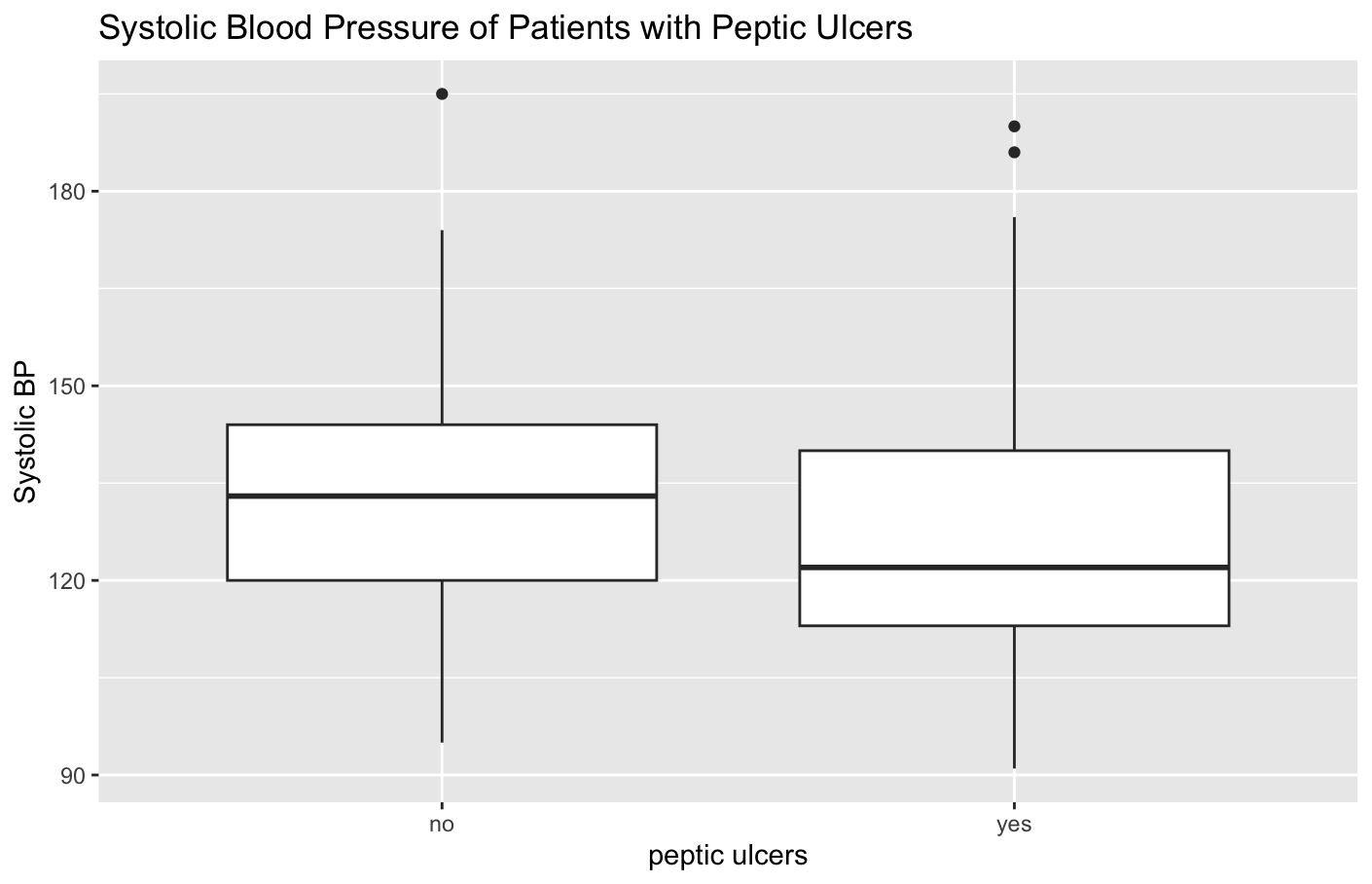
The boxplot appears to show that patients with peptic ulcers have lower systolic blood pressure, and a Google search showed there is some evidence for this.
I used a t-test to compare the data.
t.test(sbp ~ pepticulcer, data = Health_Data)

	Welch Two Sample t-test

data:  sbp by pepticulcer
t = 1.2142, df = 57.562, p-value = 0.2296
alternative hypothesis: true difference in means between group 1 and group 2 is not equal to 0
95 percent confidence interval:
 -2.889367 11.795703
sample estimates:
mean in group 1 mean in group 2
       131.3171        126.8639
The result shows that the p-value for this test is about 23%, which means there is a 23% possibility that these results are due to chance. This is not below 5%, so this is not generally considered "statistically significant". The confidence interval is around -2.9 to 11.8, which means that based on these samples, there's a 95% chance that the true difference between the actual population means is somewhere between 2.9 lower to 11.8 higher. This interval includes 0, which suggests there may be no real difference between the groups.
These results are not strong evidence that peptic ulcers cause lower systolic blood pressure.
Our next task was to see if there is any association between diastolic blood pressure and diabetes.
I checked the diabetes categories with distinct(), then found the median diastolic blood pressure for patients without and with and without diabetes - they were almost the same.
Health_Data %>%
  distinct(diabetes)

# A tibble: 2 × 1
  diabetes
  <dbl+lbl>
1 2 [No]
2 1 [Yes]

Health_Data %>%
  group_by(diabetes) %>%
  summarize(median(dbp))

# A tibble: 2 × 2
  diabetes  `median(dbp)`
  <dbl+lbl>         <dbl>
1 1 [Yes]              83
2 2 [No]               82
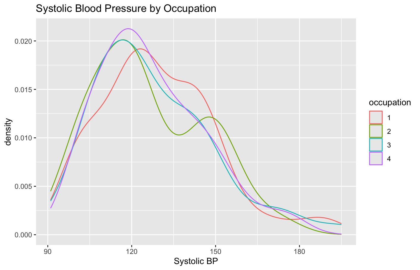
Our final task was to see if there is any association between systolic blood pressure and occupation.
I checked the occupation categories with distinct(), then found the median systolic blood pressure for patients by occupation - they were almost the same.
Health_Data %>%
  distinct(occupation)

# A tibble: 4 × 1
  occupation
  <dbl+lbl>
1 1 [GOVT JOB]
2 4 [OTHERS]
3 2 [PRIVATE JOB]
4 3 [BUSINESS]

Health_Data %>%
  group_by(occupation) %>%
  summarize(median(sbp))

# A tibble: 4 × 2
  occupation      `median(sbp)`
  <dbl+lbl>               <dbl>
1 1 [GOVT JOB]             126.
2 2 [PRIVATE JOB]          120
3 3 [BUSINESS]             122
4 4 [OTHERS]               123
I did an ANOVA test to see if the systolic blood pressure data for any occupation was significantly different from the others.
Health_Data %>%
  aov(data = .,sbp ~ factor(occupation)) %>%
  summary()

                    Df Sum Sq Mean Sq F value Pr(>F)
factor(occupation)   3    285    94.9   0.233  0.873
Residuals          206  83800   406.8
The p-value is very high (0.873) which shows the differences between occupation groups are insignificant.
I graphed the systolic blood pressure of the occupation groups with a density plot - this shows they are all very similar.
Health_Data %>%
  ggplot(aes(x = sbp, color = factor(occupation))) +
  geom_density() +
  labs(title = "Systolic Blood Pressure by Occupation", color = "occupation")
I found the correlation between systolic blood pressure and diastolic blood pressure.
cor(Health_Data$sbp, Health_Data$dbp)
0.846808
The correlation is near 1, so this is a strong positive correlation.
I graphed systolic blood pressure versus diastolic blood pressure and added a linear regression line.
Health_Data %>%
  ggplot(aes(x = sbp, y = dbp)) +
  geom_point() +
  geom_smooth(method = "lm") +
  labs(title = "Systolic Blood Pressure vs. Diastolic Blood Pressure", x = "systolic blood pressure", y = "diastolic blood pressure")
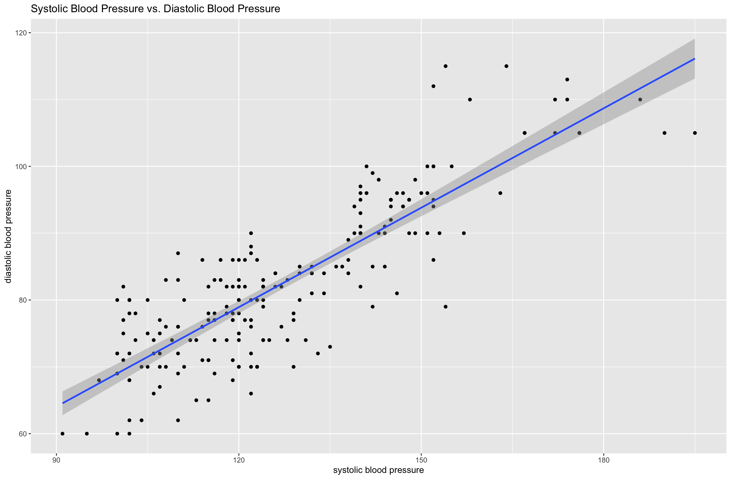
I used the lm() function to perform a linear regression analysis.
summary(lm(dbp ~ sbp, data = Health_Data))

Residuals:
     Min       1Q   Median       3Q      Max
-16.7958  -3.9366   0.1804   3.6685  19.2042

Coefficients:
            Estimate Std. Error t value Pr(>|t|)
(Intercept)  19.4068     2.7931   6.948 4.67e-11 ***
sbp           0.4960     0.0216  22.961  < 2e-16 ***
---
Signif. codes:  0 ‘***’ 0.001 ‘**’ 0.01 ‘*’ 0.05 ‘.’ 0.1 ‘ ’ 1

Residual standard error: 6.264 on 208 degrees of freedom
Multiple R-squared:  0.7171,	Adjusted R-squared:  0.7157
F-statistic: 527.2 on 1 and 208 DF,  p-value: < 2.2e-16
This gives a formula for predicting diastolic blood pressure from systolic blood pressure.
dbp = 0.4960 * sbp + 19.4068
The output of the lm() function shows there is almost certainly a relationship between diastolic blood pressure and systolic blood pressure. The "p-value" of the model is well below 5% (2.2e-16 is almost zero) which shows, if the model assumptions are true, there is only a tiny probability that the relationship shown by these results is due to chance. The "Adjusted R-squared" value is 0.7157, which means that about 72% of the variation of diastolic blood pressure is explained by systolic blood pressure - this is a high proportion.
Working through these activities really helped me consider which statistics tests and R functions to use to answer the given questions, which is excellent practice for my career as a data scientist!